Vinehall School
Branding refresh
Introduction:
Vinehall School is a co-educational day and boarding school located in Robertsbridge, East Sussex. The school was founded in 1938 and has a long-standing reputation for providing an exceptional education to children aged 2 to 13 years old. In 2022, Vinehall School approached our marketing agency to help refresh their logo and strengthen their brand codes.

Challenge:
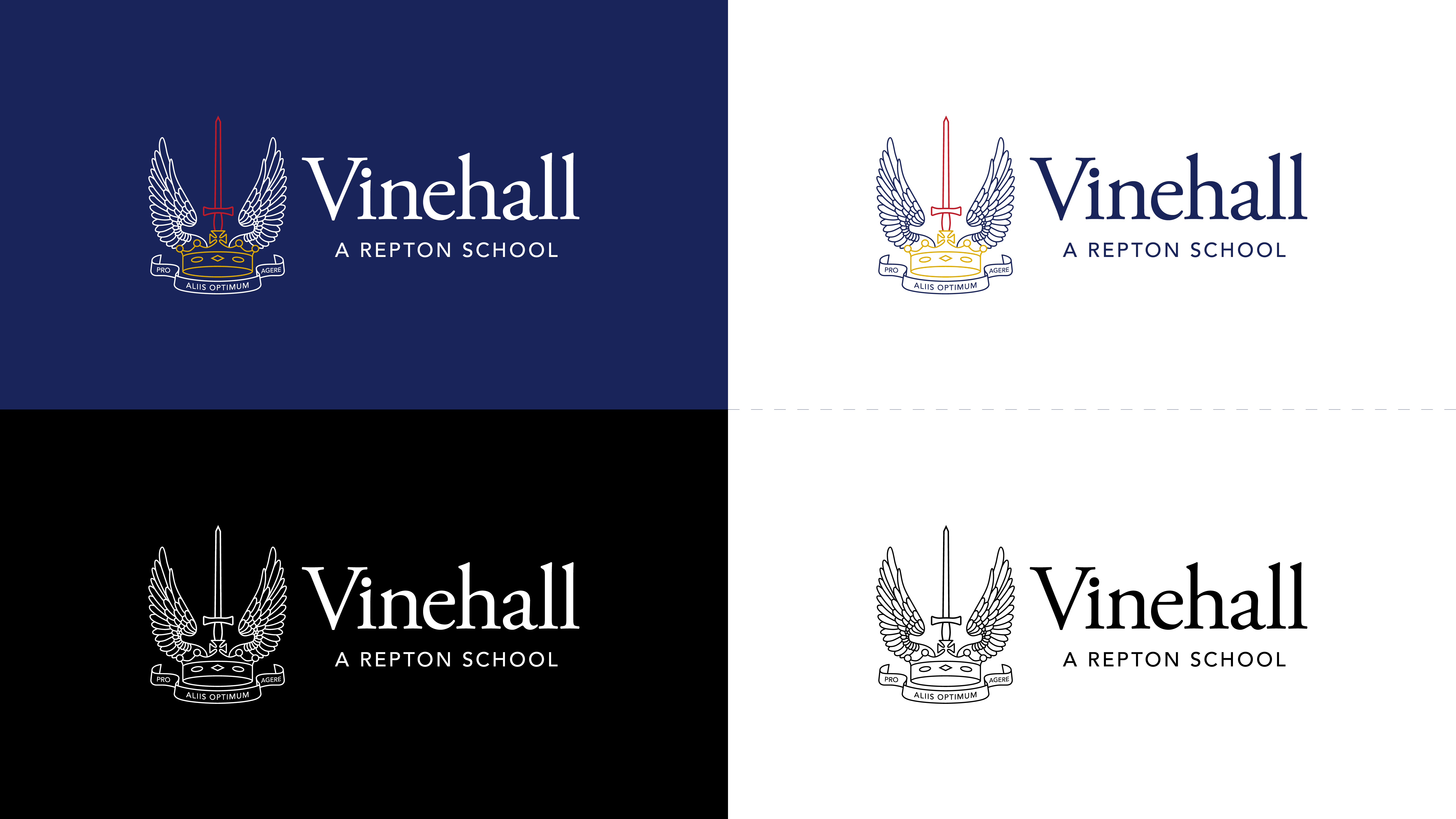
The Vinehall School logo had become highly detailed and complex, which made it difficult to reproduce on different mediums. The logo featured an intricate design, which included a crown, a sword, wings, and a Latin phrase. Our brief was to simplify the logo while retaining the key elements and to strengthen the existing brand codes. The school was insistent that the project was to be a refresh and not a rebrand in order to protect any existing brand awareness.

Solution:
Our team started by conducting extensive research into the school’s history and values to better understand their brand identity. We then held several meetings with the school’s marketing department to discuss their vision for the logo refresh. It was essential to ensure that the updated logo would still be recognisable to the school’s existing audience while appealing to potential new students and parents.
The original Vinehall School logo had a traditional and formal feel, which did not reflect the school’s welcoming and inclusive nature. We decided to simplify the design by reducing the number of elements in the logo and the complexity of the lines.
We experimented with different typography and colour palettes to create a more modern and vibrant logo. The final design featured a simplified motif with typography in the navy blue branding scheme. We also created a set of brand guidelines to help the school use their new logo consistently across all mediums.

Results:
The Vinehall School marketing department was thrilled with the new logo design, and the refresh has been well received by the school community. The updated logo is now much easier to reproduce on different mediums, including digital and print media. The simplified design has also made it more versatile, allowing the school to use it across a range of marketing materials.
The updated logo reflects the school’s welcoming and inclusive nature and has strengthened their brand identity. The new brand guidelines have helped the school use their logo consistently across all mediums, which has improved brand recognition and awareness.

Conclusion:
The Vinehall School logo refresh project was a great success. We were able to simplify the complex design while retaining the key elements and strengthening the school’s brand identity. The updated logo has been well received by the school community and has improved brand recognition and awareness. Our team thoroughly enjoyed working with the Vinehall School marketing department on this project and are proud of the final result.

