Unify reports
Most of us recognise the value of Google Analytics which helps you to understand how your website is being used, evaluating the performance of your marketing, content, services and more. So imagine the value of being able to collect research data on your school prospectus in the same way that you can for your website.
For Unify users, we are delighted to introduce a brand new marketing
intelligence service, UNIFY REPORTS, which can do exactly that, providing a host of data and features that will deliver lots of valuable information to improve your marketing planning, decisions and applications.
When it comes to offline marketing such as the school prospectus, until now the only data available would be the numbers printed, posted or handed out at an event; not very helpful when looking to update your prospectus, pinpoint the most important information or decide exactly how many to print.
Unify Reports can revolutionise these decisions, providing data on your school prospectus which you have never had before. What is more, all the data can be split by gender and everything is displayed live with the option to download chosen statistics into various formats such as SVG, PNG, and CSV for reporting purposes.
Features of Unify Reports
- Number of printed copies sent out vs PDF page turn versions
- Which pages have been selected
- How many times the PDF page turn is viewed
- Which are your most selected pages
- What device is used
- A timeline on sending out prospectuses
- Who in the team is sending what
Benefits of Unify Reports
- A deeper understanding of what families are most interested in
- Data to aid the restructure your prospectus for optimum effect
- How the marketing budget is being used and to what effect
- Reports for SLT and Trustees
- Reduction of printing costs by using PDFs
- Reduction of waste by only printing what you need
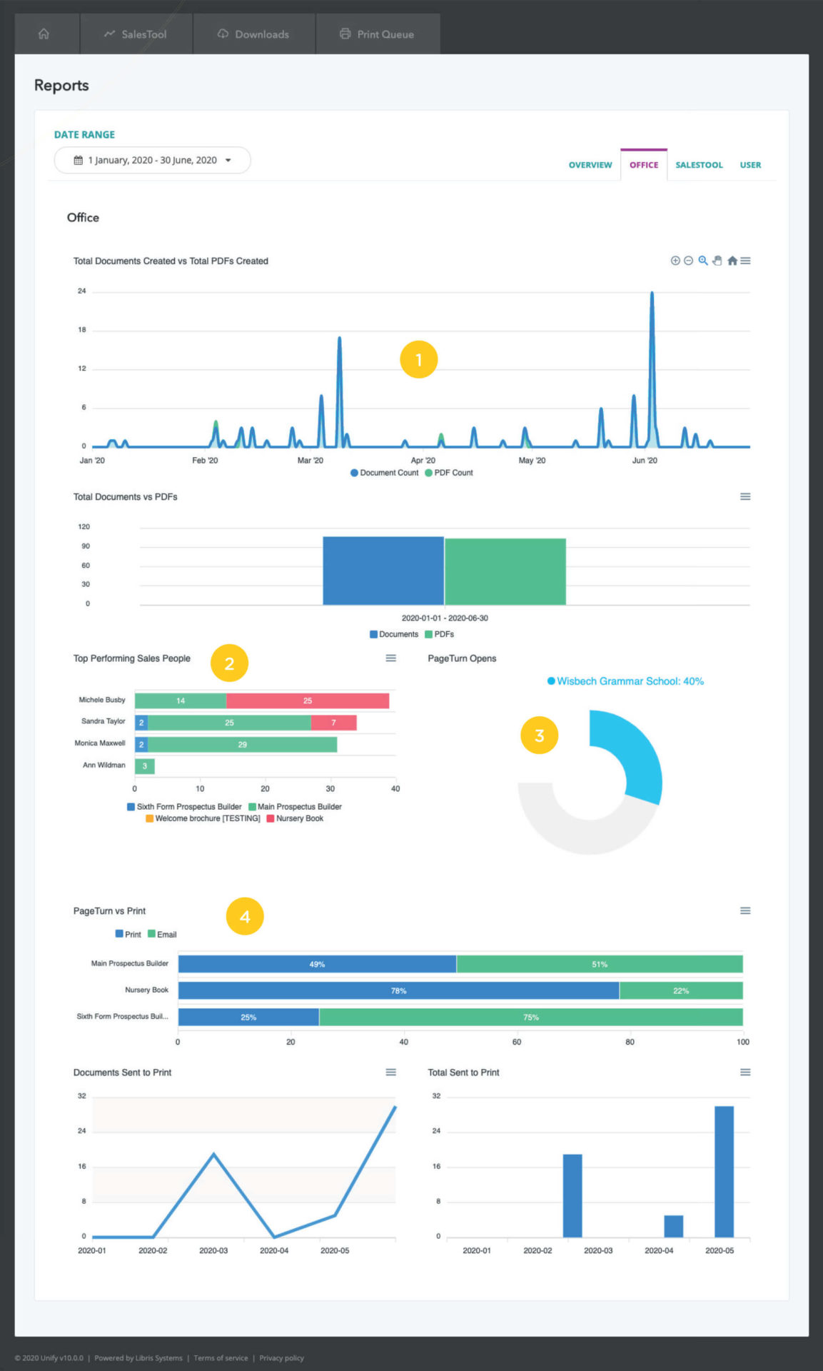
The example below shows how a school has created a separate sales tool per brochure: Main School prospectus; Sixth Form prospectus; Nursery book; Welcome brochure. In one quick view you can see exactly how many brochures you are using for each area of your school’s business. In this graph you can also see how many have been sent, broken down by each member of the team.
Using the date range facility, it is possible to see a snap shot of the total number of documents and PDF brochures created each month. This has the benefit of allowing you to check against any online or offline marketing campaigns to see what effect it had on actual prospectus requests as well as an understanding of peak times of demand.
This example shows various different brochures and the amount each user has created, helping you to identify quantities for each type.
When it comes to the PDFs sent out via email, the school can see if and when the PDF has been opened.
A graph shows the marketing department exactly what documents have been printed or emailed. This has the benefit of allowing you to see what the demand is for print vs a digital prospectus.

