We had some great success in 2019 with our software revolutionising the way independent schools engage with families. Not only that, but we are also moving closer to being a carbon-neutral company. We’re offsetting our carbon emissions by planting trees in protected sites in the Scottish Highlands where they will create homes for wildlife, and create forests for the future. It will be a long road, but this year we will undertake an audit and see what other measures we can take to reach this goal in the next 3 years.
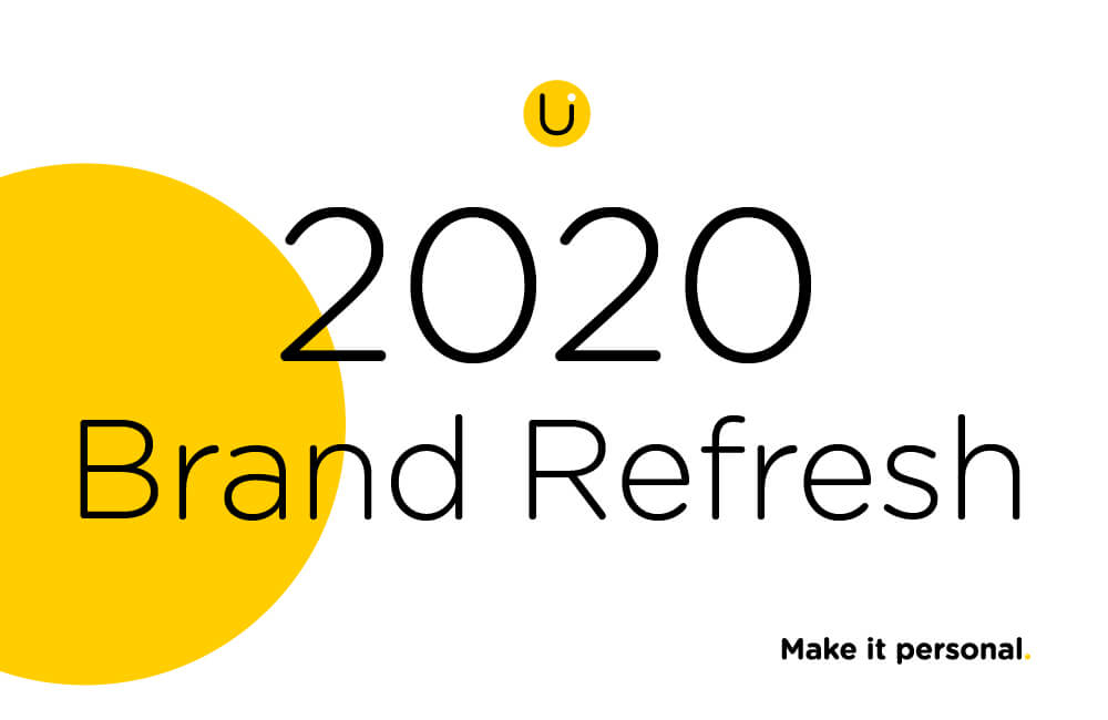
Over the last 2 years, we’ve experienced some brand struggles, as most companies do at some point. Mid last year, I decided it was time for a good hard look at ourselves to refresh our brand to reflect who we are, where we are going, and what we want to achieve.
The Audit
I started by looking at everything we put out into the world. Our website, marketing materials, email templates, business cards, conference stand designs and of course, our app Unify.
After taking a step back, I could see the core colours were mostly consistent although at times they did differ slightly. The overall style had evolved bit by bit over time with new elements being added, such as chalkboards, lockers and chalk fonts. These were being added as more people were involved in updating different aspects. It all ended up being disjointed and to be honest, a little ugly.
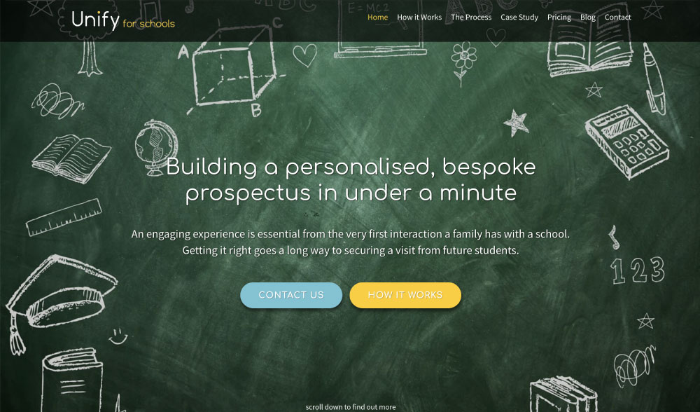
Website Landing Page – BEFORE
Moving forwards
After an internal audit, I wanted to solidify our brand and bring it back to the initial vision for the company. Enter Stewart from Restless, my go-to contact for all things branding.
I had a clear idea of direction but needed help to get there! Stewart analysed Unify Schools and the history of how/why the brand evolved. He noted the direction and how we could most accurately present ourselves. I sent over some images and links to use as reference points, and he went away to come up with a plan. Stewart pointed out that our brand would benefit from a refresh rather than a rebrand.
Before
The logo
The logo was the first item to be addressed. Previously it had evolved from a free font when the software was being developed. It hadn’t been ‘crafted’ from a designers perspective. The logo needed to be adaptable for the web, print and in large format for use at exhibitions.
Stewart first looked at professional fonts for the base of the logo that would also form the foundation of the brand for consistency. From there, he made smaller refinements to the logo to make it unique to us.
After
Stewart said…
“The logo’s main point of difference has always been the dot above the ‘i’ and this needed to stand out even more as it came to represent the individual and personalisation aspect of the software. We also wanted to use the yellow dot as another element to link all of the branding for Unify.”
The refresh
For the broader part of this rebrand, Restless identified that the brand had slowly lost its primary identity of being a piece of software. They’d come to the same conclusion I outlined earlier, the brand had become disjointed and a little ugly.
The colours
By stripping back the colour pallets back to black, white and yellow helped showcase the software element of Unify. While using the bright and colourful designs of the prospectus to keep the personality of the schools, it was an excellent way for the brand to evolve.
The illustrations
I highlighted that the Unify software does much more than personalise a school prospectus. As a result, there would be times that the software still needs to have a personality of its own. With that in mind, Stewart developed a series of illustrations and icons to work with all aspects of Unify.

The line drawing style was simple and complimented the simplicity and ease of use of the Unify software.
The tagline
The final element of the brand refresh that tied it all together was a call to action/tagline, something that we all felt summed up Unify succinctly as possible. ‘Make it personal’ is the perfect phrase that works for all elements of the Unify branding, on and offline.
The results
We received an updated logo, font, tagline and a renewed personality that reflects us as individuals within the company, as well as the software itself. Friendly, approachable and professional.
A series of animations have also been developed that showcase the personality of the Unify brand perfectly. Stay up to date with us on social media and you’ll spot these.
After the refresh, the central entity to change was this website. You can see all of the work completed above being showcased. I like to think our collaborative effort has paid off. Only a week after the “soft launch”, we’ve received multiple compliments from our existing schools, as well as those we are in the process of speaking to.
I want to thank Restless, Stewart in particular. Due to his ability to understand our needs and materialise our collective vision for the refresh, it has been a smooth process.
If your school is looking at a rebrand or brand refresh, Restless run periodic branding workshops that are free to attend. You can sign up to receive notifications of our next free branding workshop below.
Attend a FREE branding workshop
Alternatively, feel free to get in touch with Stewart directly and let him know you’ve seen the new Unify Schools refresh. Stewart is ever enthusiastic and would gladly speak to you more about the process and how he can help your school.